Ishizaka Sangyo Co., Ltd. is celebrating its 55th anniversary and will be renewing its corporate mark.
To mark its 55th anniversary this year, Ishizaka Sangyo Co., Ltd.* has redesigned its corporate mark to further clarify its corporate identity , under
the creative direction of graphic designer Taku Sato . *Head office: Iruma-gun, Saitama Prefecture, Representative Director: Noriko Ishizaka, hereinafter referred to as “Ishizaka Sangyo” <New corporate mark>
① New corporate mark
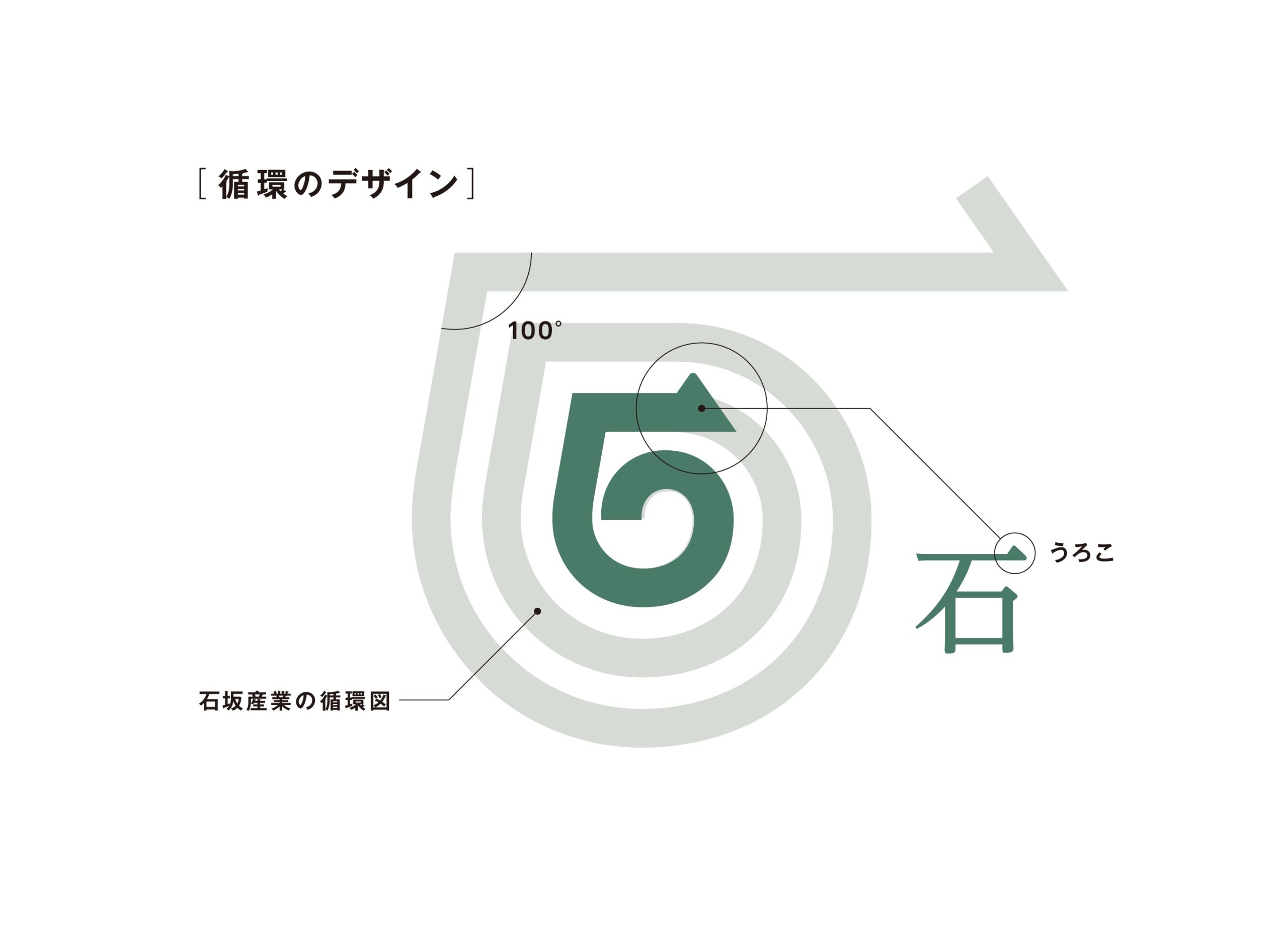
Ishizaka Sangyo has adopted the vision of “Zero Waste Design*” to realize a sustainable society, and operates an industrial waste intermediate treatment plant that puts the SDGs into practice, as well as the environmental education field “Mitomi Konjaku Mura.” The new corporate mark is based on green, which represents a sustainable earth, and uses the kanji character for “stone,” which is part of the company name, as a motif, pointing out the direction from the environment to the future. The angle in the upper left corner is 100 degrees, visually conveying the strong determination to aim for 100% waste reduction and recycling rate.
*Ishizaka Sangyo “Zero Waste Design” Vision https://ishizaka-group.co.jp/vision/vision
② Start date of use
The system will be gradually introduced from April 4, 2022.
③ New corporate mark creator
/
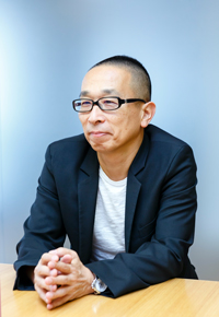
Graphic designer Taku Satoh
graduated from the Department of Design at Tokyo University of the Arts in 1979 and completed his graduate studies there in 1981.
After working at Dentsu Inc., he founded the Taku Satoh Design Office in 1984 and is currently the CEO of TSDO Inc. His work
began with product development for Nikka Whisky Pure Malt,
and includes package design for Lotte Xylitol Gum and Meiji Oishii Gyunyu (Meiji Delicious Milk),
graphic design for PLEATS PLEASE ISSEY MIYAKE, and
logo design for the 21st Century Museum of Contemporary Art, Kanazawa and the National Museum of Nature and Science. He has
also served in a wide range of roles, including art director for NHK Educational TV’s “Nihongo de Asobo,” general director of “Design Ah!”, and
director of 21_21 DESIGN SIGHT. In spring 2021, he received the Purple Ribbon Medal.
The shape of a “stone” symbolizes recycling . Graphic designer Taku Satoh.
Ishizaka Sangyo is a company that handles industrial waste. While we now live in an age where society as a whole is paying attention to the environment through the SDGs, Ishizaka Sangyo has been one of the first to undertake various initiatives centered around “circulation,” including waste recycling, satoyama revitalization, and renewable energy utilization. Having reexamined our previous visual identity, we have created and proposed a new mark with the words “Designing Circulation.”
While circulation is often expressed as a circular ring, I have long felt uncomfortable with the idea of a ring returning to the same place. Therefore, I created a mark that expresses a circulation that does not return to the same place, in other words, a spiral, by superimposing the kanji character for “stone” (石), which is Ishizaka Sangyo’s name, on top right. The “scale” in the Mincho font on the top right is made into an arrow, expressing Ishizaka Sangyo’s strong will to rotate (circulate) and turn the corner to reach the next destination.
For more details, please see below.
“Ishizaka Sangyo Co., Ltd. Celebrates 55th Anniversary with New Corporate Mark (PDF)” is available here.
Facility Tour and Training Program
We offer factory tours throughout the year that are open to all visitors.Our programs include tours designed for adults, family-friendly tours for parents and children, as well as tours tailored for companies and organizations.We provide customized courses based on your needs, including the theme, budget, and available time.
Contact Us
For inquiries regarding industrial waste acceptance, media interview requests, or consultations about collaboration and partnerships, please contact us here.